Back in ye olde days of indie publishing, it used to be the work of moments to tell an indie title apart from a conventionally published one simply by looking at the cover. The indie books would be the ones with no cover art, amateurish cover art, a hilariously bad CG image, or a photograph which only had a vague relevance to the subject matter. But it was the story that mattered, right?
But in a saturated market, that simply won’t wash any more. You need to be noticed and it’s as simple as that. Simply consider how you purchase books yourself if you’re browsing for something new at Amazon. You might narrow your search down to a genre you’re interested in and then you scroll down, glancing at the titles and the thumbnail cover images. So if a book doesn’t have a cover that leaps out and grabs you, you’re not going to buy it. And what’s more, it’s not enough to have a good cover image; you also have to put some thought into how effective that image is going to be when it’s shrunk down as a thumbnail, because that’s how most people are going to be exposed to it. If it’s too murky or too busy, it’ll not be effective, no matter how gorgeous it is at full size.
Fortunately, these days it’s easier and more cost effective than ever before to source a really good cover, something that wasn’t the case a few years ago. I want to give a few samples here from cover artists I have used and the experiences I’ve had with them, giving them a shout out so you may consider your needs for your own next cover art.
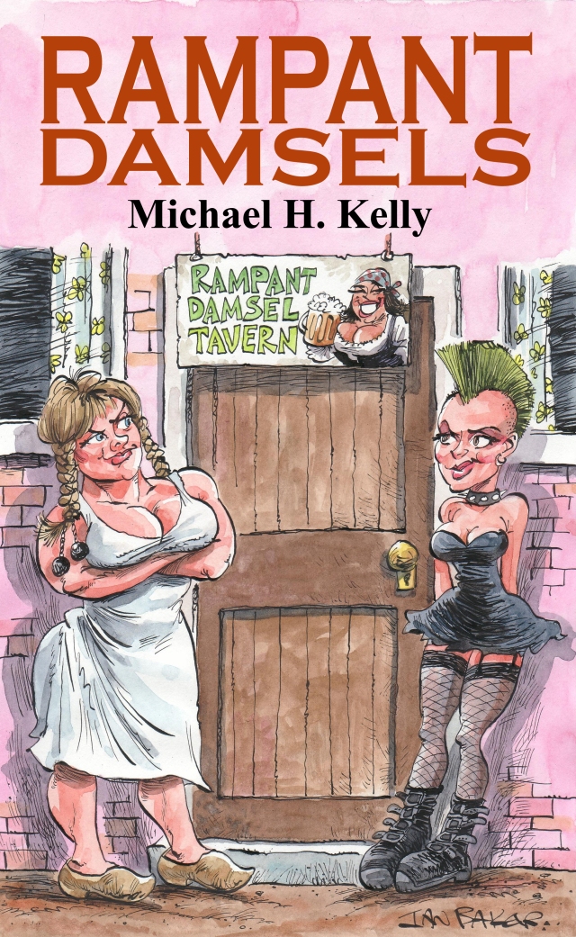
Rampant Damsels was the first book I self-published back in 2009 and I knew I wanted something special for it. I scoured the Net trying to find an artist / cartoonist with the right style for the comedy fantasy image I wanted, who was open for commissions. I eventually found the portfolio of British cartoonist Ian Baker, who produced the above masterpiece for me, costing me some £220 at the time if I recall correctly. But it’s a beautiful image that meant I actually sold a few books, encouraging me to continue on instead of shriveling up and dying. The image is colourful, striking, bold, simply composed so it stands out as a thumbnail, but full of detail at full size, and leaves the viewer in no doubt that the title exudes a kind of raunchy humour.
The next three covers I want to show were all prepared for me by a great guy on Fiverr named Boris. He is fast, sources a wide selection of images based upon your brief and offers nine or ten alternate covers for you to choose from, he’s VERY cheap and a really great guy to work with, coming up trumps every time.

‘Vicars and Tarts’ cover by Decovski
The first job I put his way was for erotic comedy novel Vicars and Tarts. I had a few suggestions for the cover: if possible, I wanted the colour to be a warm orange tone to suit the holiday theme of the novel; I wanted it to feature a Bible to reference the titular vicar, and a pair of lacy panties for the tarts; I also wanted these latter to be draped over a glass of red wine, as a reference back to the previous book in the series, Water Into Whine. The above cover contained every single element I had asked for. There was also an alternative, which in some ways I preferred, it being a photograph of a pair of panties draped over a glass of red wine. However, it lacked the Bible and the orange tone. I probably would still have gone for that alternative if I was judging purely by personal preference, but here’s where you have to be canny when selecting a book cover. The cover chosen above was a much trendier, more modern style of image, and WOW, does it ever stand out as a thumbnail! And these were the decisive factors. The book sold relatively well right from launch and continues to do so, so I obviously chose well.
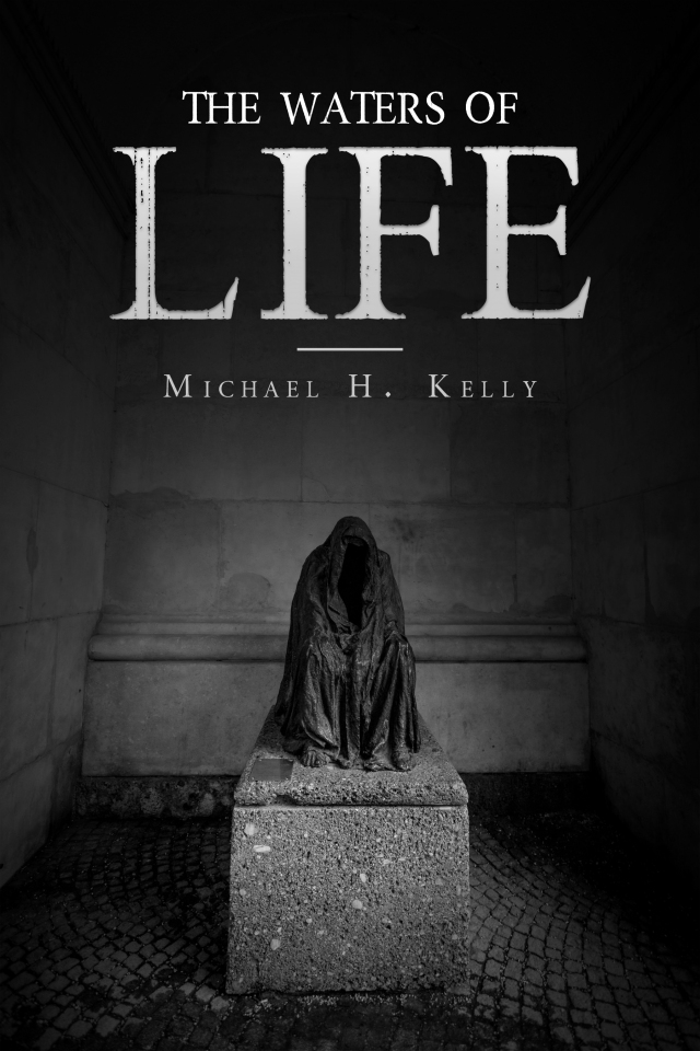
Boris’ next commission for me was a much more sombre one, for the horror novel The Waters of Life. For this, I specified a stone sarcophagus in a vault, with a sinister hooded figure, and just look at the macabre black and white stock photo Boris discovered for me and adorned with suitable title fonts! Again, he provided several alternatives, some of which were great and very tempting, but this one is just so full of eerie menace it was a no-brainer. It also reduces down to a suitably sinister and effective thumbnail. It did the trick, the book sold instantly and well.
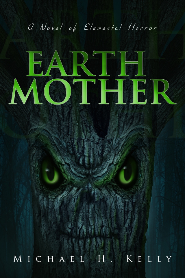
By now, I was becoming painfully aware of the shortcomings of some of my earlier novels which had never performed well, all of them with half-arsed cover designs. It was time to start putting my house in order and relaunching some of these old titles with properly designed covers. I began with a horror novel titled Earth Mother, which had never sold well at all, but which attracted raving reviews from the few people who did read it, so I knew the problem wasn’t with the writing. Boris produced the above image based upon my description of the book, using the dark green colour tones I requested together with a bright green font and matching eyes for the Elemental horror, which really stand out and make a striking thumbnail image. The results? This cover only cost me £15, but in the three weeks since the book was relaunched it has sold more copies than in the previous three years! Speaks for itself, doesn’t it? Spending just a few quid on a decent cover can make that much difference!
I had been continuing to write new titles in the Damsels series in the meantime, and a couple of the middle titles in the range definitely need new covers now too, a job I’ll be getting round to. But when I came to write the most recent, Damsels and the Dark Arts, I decided that it really needed a decent cover, something which would do it justice. So I decided to commission an artist once again. Some books just need original artwork and can’t be served by stock images and that’s just the way it is. Once again, I wanted to find an artist who could really capture the look and feel of the characters and the books’ humour. I scoured hundreds of fantasy artists on Deviantart before commissioning Kelsey Bigelow to produce the cover, pictured below. She used the original Rampant Damsels cover as reference for the two main characters, but updated their clothing at my request, she included other elements I requested, such as the important skeleton key, she used the Tarot card ‘The Devil’ as a template for the image as suggested and gave the whole image a range of beautiful blue tones as I had specified. Sheer perfection, probably my very favourite book cover ever! The cost? About $200. Artists (and good ones) can be got for less, of course, but I was very choosy about getting an artist with a specific style.
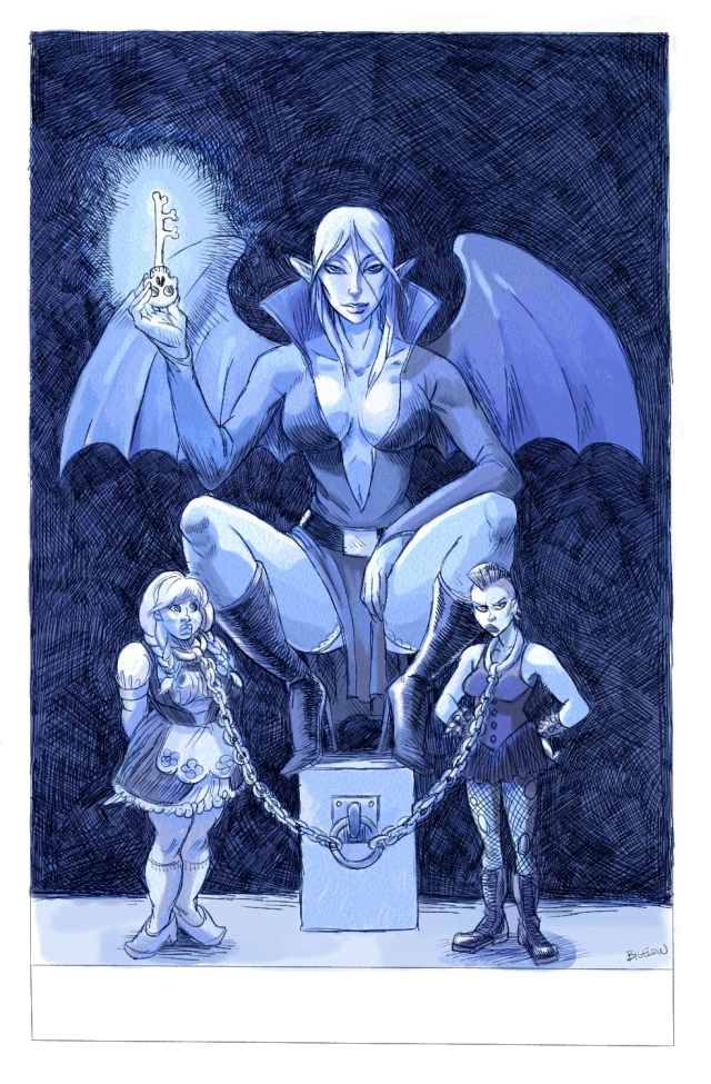
Damsels and the Dark Arts, cover art by Kelsey Bigelow
Most recently, I had another old novel recovered, this time my contemporary Celtic fantasy, The Wave Sweeper. This one was done for me by Rachel McGrath, herself an exceptionally talented author and illustrator, who really succeeded in producing the goods here, as pictured below. This was the first time I have opted for a cover image which wraps around the whole cover, and it’s extremely effective. The imagery, fonts and colour tones are all illustrative of the book’s blend of warm melancholy.
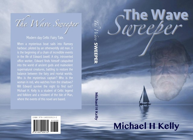
These days, it’s not a struggle to find a highly capable cover artist and you don’t have to pay a fortune for it any more. But it’s certainly not optional: your book needs a decent cover if it’s to have any hope of selling. My own experiences of the jump in sales after upgrading Earth Mother and The Wave Sweeper have proved just what a huge difference it makes. Make sure it’s what you want, make sure it conveys the mood, and make sure it makes a good thumbnail!

Thank you so much, great blog post by the way. I agree the covers are so important 🙂
LikeLike
Great advice! The Earth Mother does make a world of difference – I can see why sales jumped afterwards.
For a future essay, could you discuss the importance of reviews for indie writers and suggest ways on how to provide constructive criticism without discouraging potential readers?
Also, what about editing? I often get frustrated reading otherwise enjoyable indie books that suffer from problems of spelling, timing, and construction that a good editor would catch.
LikeLike
Thanks, Trevor. I’ll try to address all of those things in future blogs!
LikeLike